Sustainability Saviors
Sustainability Saviors offers sustainable products on their mobile-web experience to make eco-friendly shopping accessible easily.
My Role: Research and UI and UX design (Solo Project).
Timeline: August 2023 - October 2023 (6 weeks)
Tools Used: Figma, Fig Jam, Pen, Paper
Overview
Sustainability Saviors offers a range of sustainable products through their mobile-web platform. Statistical data indicates that, on average, 50% of users browse through 7 item pages before leaving the site without adding any items to their cart. Furthermore, 70% of users who place items in their carts abandon their purchases at the registration page. Currently, creating a user account is a mandatory step for completing a purchase.
Problem
Sustainability Saviors aims to improve the conversion from browse to completion of checkout to increase revenue on the product’s mobile-web experience.
The customers who place an item in the cart do not complete the purchase and abandon the cart at the registration page and the company wants to narrow the ‘intention to action gap’.
Solutions
Fast checkout option to ease the checkout process and cut down the user’s time to create an account.
A rewards system to help users earn points and save money on their next purchase.
Finally, providing users with a subscription option would allow them to stay updated on new arrivals, discounts, and sales, fostering a direct communication channel via email. This initiative would facilitate the collection of user emails, enhancing engagement and keeping them informed about the latest offerings and promotions.
Reduced the browsing time from homepage to checkout by 60%.
My Design Approach
Phase 1- Research
Secondary Research
1. Competitive Analysis:
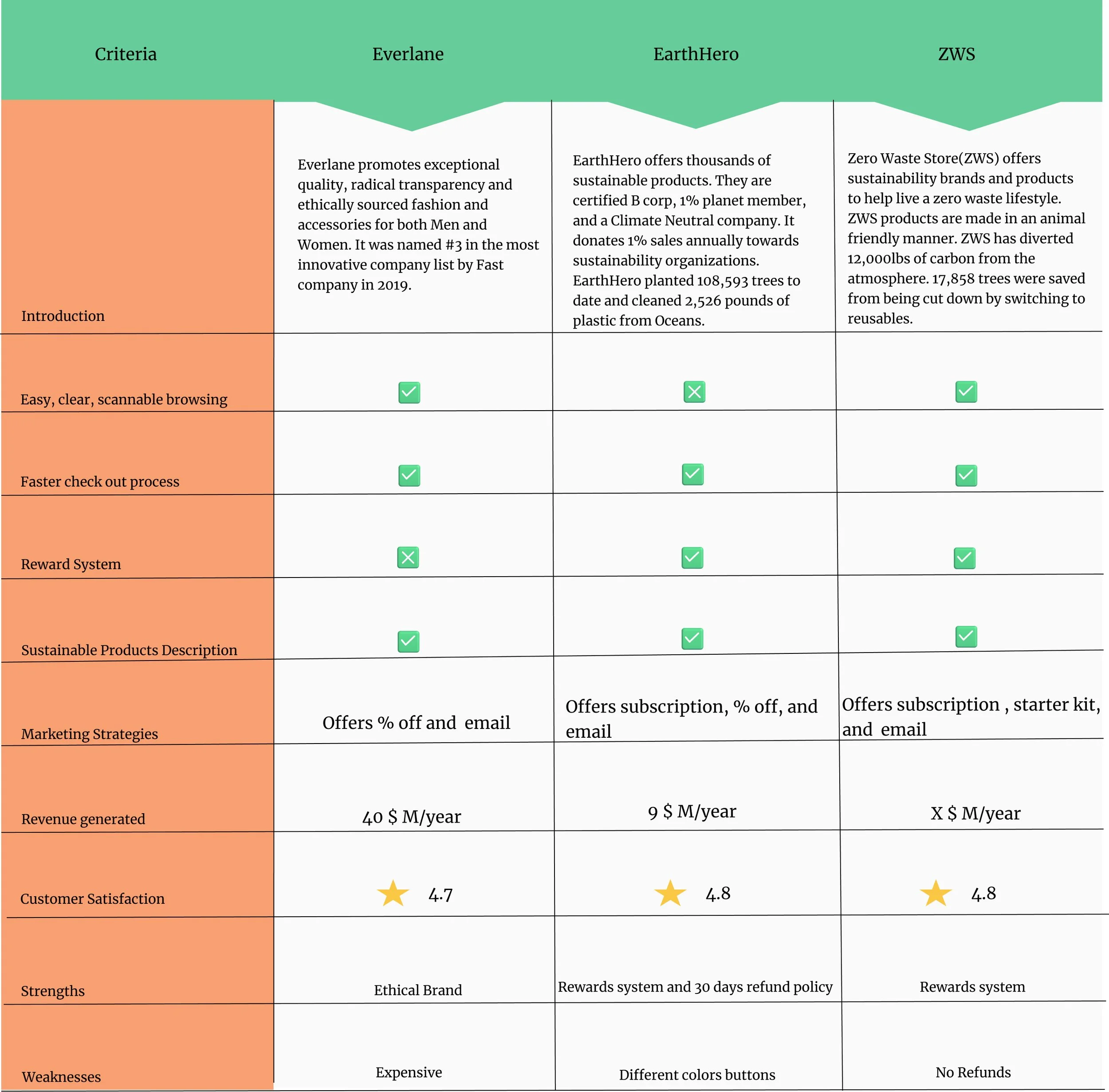
Secondary research helped me collect data from the competitive analysis of three different companies. I studied Everlane, EarthHero, and Zero Waste Store. It provided valuable insights into user's needs, goals, and expectations and design trends in the market.
I found that Everlane, EarthHero, and Zero Waste stores have fast checkout systems where users can easily checkout with the help of GPay and PayPal without creating an account.
EarthHero and ZWS provide rewards and points to their customers that help them earn free shipping, and free items on their next purchase.
Swot analysis of the Sustainability Saviors helped me evaluate the company's overall performance by studying its strengths, weaknesses, opportunities, and threats. Sustainability Saviors has strong brand value because it is committed to creating healthier living spaces.
2. SWOT Analysis
Strengths: It uses organic, recycled, renewable resources, and carbon-neutral, upcycled sources. It is committed to 1% for the planet.
Weaknesses: Users do not complete the purchase. And it has a limited sustainable product description. Also, no fast checkout and guest checkout options are available for the customers.
Opportunities: The company has a few new opportunities for enhancing the mobile-web experience and increasing revenue by providing rewards systems and a fast checkout process to the users.
Threats: There are a few threats that the company might come across such as lower conversion rates, reduced usability of the products, and generating less revenue.
Pain points:
Due to time constraints, users do not like to create an account and go through the longer checkout process.
It takes longer to find products due to the wide variety of categories.
Sustainable products are expensive.
3. User Persona:
Goals:
Users aim for a fast checkout process.
To find sustainable products easily.
To live a healthy lifestyle.
These research methodologies helped me better understand my competitors and my company's overall performance.
Finally, I concluded that providing the fast checkout process and reward system to the Sustainability Savior’s users would help increase the conversion rate.
A fast checkout system would give freedom to the users to complete the purchase without creating an account and narrow their intention to action gap.
Lastly, giving the users a subscribe option would help them know first about the new arrivals, discounts, and sales. This in turn would help collect user’s emails.
Phase 2-Design
User Flows:
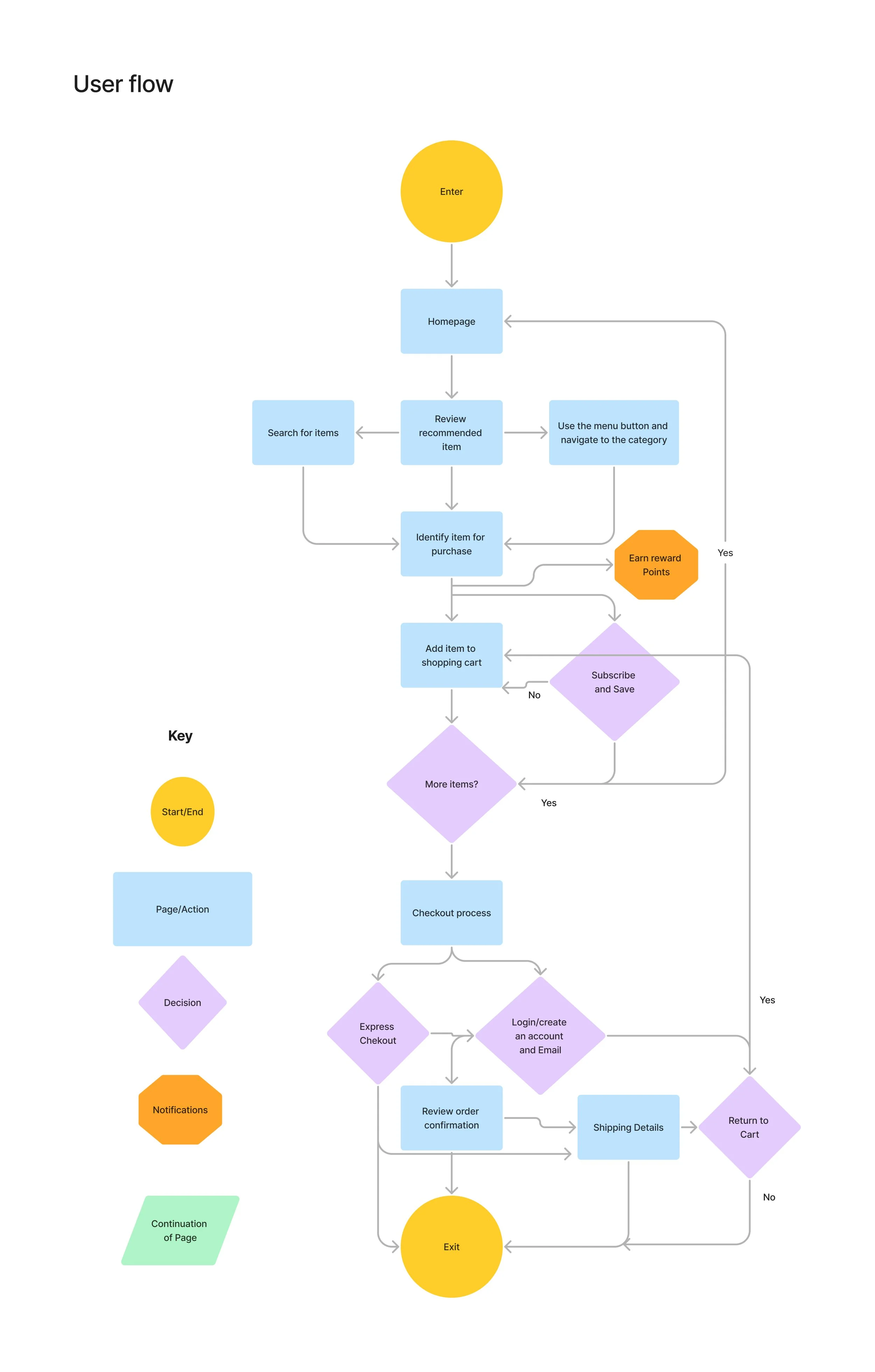
Research methodologies and personas helped me to know my user’s pain points, goals, and motivations. This better understanding of their needs further helped me in creating better User flows.
2. Sketching
User flows helped me sketch out the initial design to guide the mobile web experience and help users achieve their goals.
Phase 3-Validation
Design Solutions
Home Page
Well-organized categories with all the information available in one place.
Here the Subscription information and Starter kit options are also easily accessible to the users.
Faster checkout
A faster checkout process to help increase the conversion rate and cut down extra steps to create an account.
Product Description
Provided a detailed description of the product and outlining key benefits.
And clearly explained points earned on an item.
Menu
To provide quick access to the navigation.
Rewards
Created a rewards system to make users feel valued and help them come back to purchase more products.
This would also bring a customer closer to the company.
Order Summary
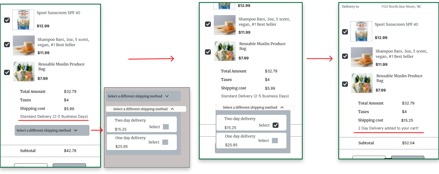
Clearly broke down the order summary
to help users to know that the
pricing offered is transparent and there are no hidden costs.
Usability Testing Round 1
I conducted five moderated usability tests with five different participants. I recruited participants that are eco-savvy people, who like to use sustainable products and wish to have a positive impact on the environment.
The main goals were
To identify if the users are able to finish the checkout process.
To identify if the users are able to use a fast checkout process efficiently.
To learn if the users like the rewards and points system and are ready to enter the email to earn points.
To discover where the users get lost in the process of completing the task.
To identify the accessibility concerns and challenges with the design’s interface.
To identify overall user satisfaction with the mobile web experience.
5 Major improvements in my design:
A few things missing on the express checkout page.
Added a sign-up option next to login for the new users.
Changed the button form of express checkout to the text to avoid any confusion for the users.
Added the number of items that were added to the cart in the order summary.
2. No emails were collected at checkout to earn points on the next purchase.
Added the option to collect users’ emails to help them earn points on their next purchase and track their shipping.
Also, included the points earned on each item, next to each product to help users keep track of their points/rewards earned
3. Improved the function of the dropdown menu.
Changed the function of the dropdown menu so that it can close itself easily after changing the shipping method.
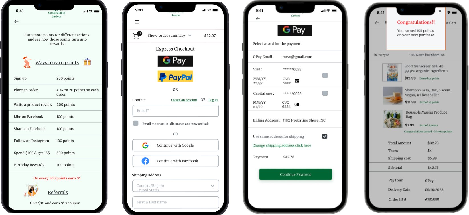
4. Explained to users the ways to earn the points and save money on their next purchase.
Users were confused with the login points so I changed it to the Sign up points to make it clear for first-time users.
Users were confused about earning 20 points on each order so I elucidated for the users that they would earn +20 extra points along with the total product points earned at checkout.
Lastly, there was no explanation of how earning points would save money for the users. So, I made it easy for the users to understand that for every 500 points they would earn $1.
5. Explained total points earned by the users at Payment confirmation and added a menu button.
I changed the reference ID number to the order ID number to make it easy for the users to track their orders.
Also, added the total points earned by the users so that they can keep track of their points/rewards earned.
I included the menu button next to the back button so that users can easily navigate.
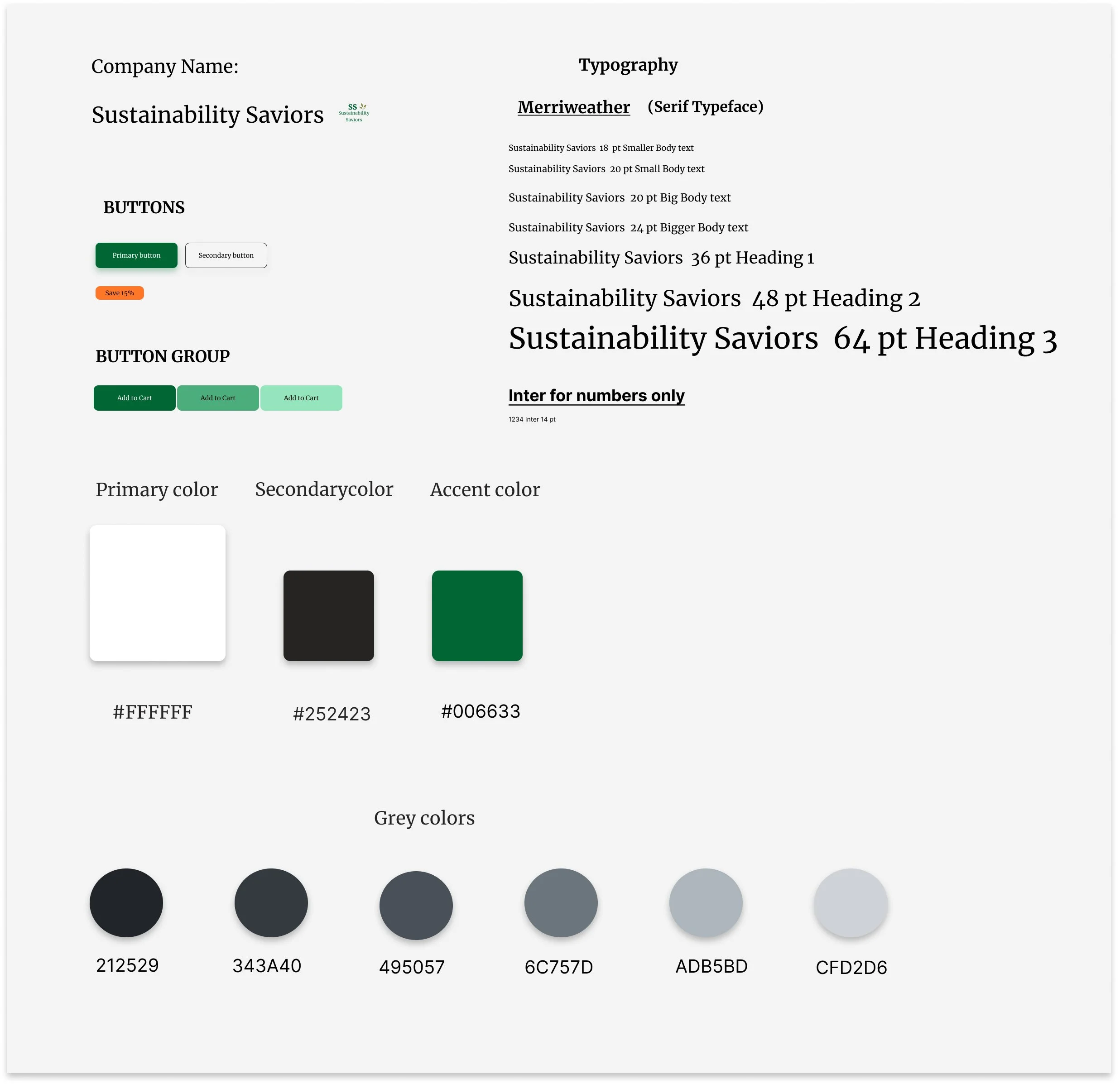
Style Guide and Brand
Brand Personality
“Sustainability Saviors” is on a mission to save the planet’s natural resources by easing shopping with a one-stop destination for sustainable products.
Brand Attributes
Savvy
Focused
Caring
Serious
Phase 4-High-Fidelity Designs
Phase 5-Usability Testing Round 2
3 Major improvements in my design
1. Google and Facebook logins were added to the login page and at checkout.
2. Included sign-up points to an account page.
Added sign-up 200 points to create an account page to prompt users to create an account and provide them information regarding the ways to earn points.
3. Replaced ‘recent products’ with the ‘most popular products’ on the homepage.
Users were confused with the title ‘recent products’ so I changed it to ‘popular products’ to make it easy to understand.
Final Product
Final Product

Prototype Link: Sustainability Saviors
Takeaways
Working on the e-commerce case study was challenging and rewarding at the same time.
I found that in e-commerce platforms, demographics play a huge role because designing an interface for a wide range of users was challenging.
There are many transactional processes like payment, checkout, and product selection, and creating a seamless design experience throughout the entire process was exciting.
A well-planned information architecture is essential as e-commerce has many products and categories. I planned my design intuitively for users so that they could navigate efficiently.
Designing interfaces that communicate security measures and build trust is a critical aspect of e-commerce.
I designed a consistent experience to build a positive experience for the users and increase the conversion rate.
Future directions
Cancellation and Return policies:
I would work on the returns and cancellation policies in the future as this would help build trust and loyalty about the brand.
Understanding the Market Landscape :
Studying competitors is not just a one-time process but regularly updating competitive analysis ensures that the business stays ahead in the dynamic competitive market.
Advertising Campaigns:
To build brand awareness and increase sales and stay competitive I would work on the well-executed advertising strategy to enhance the growth and success of the business.


